One workspace. One context.
Pages, files and conversations belong together. Every workspace has a file browser and an agent; their ownership should be obvious.
 bysmeiduONO is an opinionated desktop browser agent—an experiment by Smeidu.
A place for you,
your work, and your agents.
The identity and interface of an opinionated desktop browser agent. Built to make room for what comes next.
Get the design kit
01 / Principles
ONO brings the browser, files and agents into one desktop experience. The design makes those relationships visible, while giving the work the most space.
Pages, files and conversations belong together. Every workspace has a file browser and an agent; their ownership should be obvious.
Content leads. App controls, workspace controls and window controls have distinct homes. Decorative chrome earns its space.
A quiet header can still be powerful. Put secondary model, context and usage information behind a clear disclosure.
Working, waiting and needing a reply must look different. Pair a symbol with words; animation and color are supporting cues.
Blur can connect a surface to its surroundings. It must never turn the prompt or a message into text floating over a photograph.
Keyboard access, reduced motion, solid materials and e-ink are part of the system. Personalization should preserve orientation.
This first edition documents the current app and defines a consistent way to use its brand beyond the screen. New composition and production guidance is a design direction; it does not imply every legacy screen has been migrated.
02 / Identity
Shared Frame is both symbol and wordmark. Two equal, open O frames share the diagonal N. Human and agent have their own space, with a connection between them.

The app icon uses the padded charcoal tile. The small in-app menu mark inherits its control color. Keep the full lime identity for the Dock and brand signature.
Always uppercase ONO. Keep smeidu lowercase in the creator credit, set in Syne. Use live text for the credit rather than squeezing it into the symbol.
The existing 26px menu mask and tiny favicons are purpose-built optical exceptions to communication sizes.
Don’t stretch the frame.
Don’t let the mark disappear.
ONODon’t repeat the name.
03 / Typography
Roboto does the reading and the work. Roboto Mono gives technical information a steady rhythm. Syne signs the creator’s name. All three fonts are hosted locally.
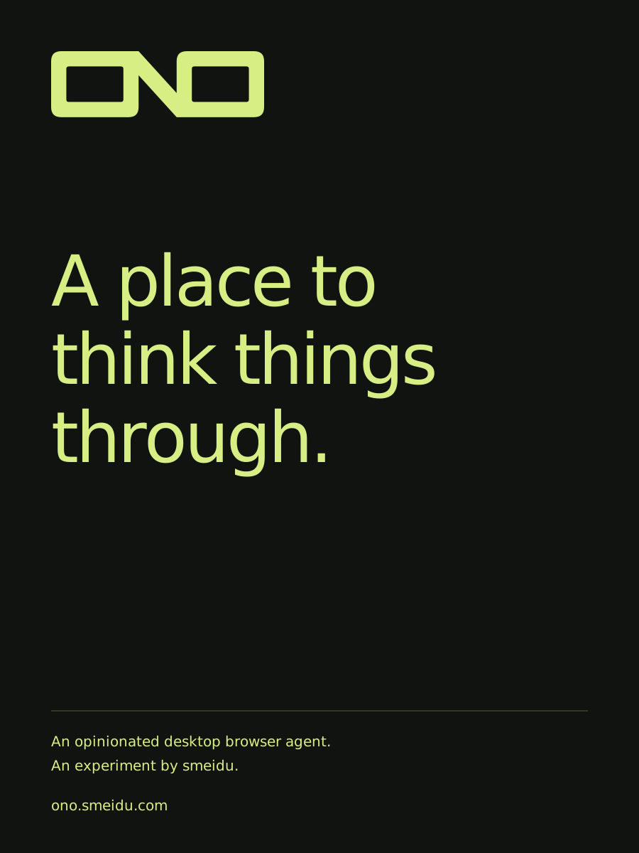
A place to think things through.
Aa Bb Cc · 0123456789 · → ⌘ ↔
App UI, website, body and display
Variable weights 100–900
WOFF2 ↓Font license ↗Technical labels, numbers and Terminal metadata
Variable weights 100–700
WOFF2 ↓Font license ↗The smeidu creator signature
Variable weights 400–800
WOFF2 ↓Font license ↗| Role | Size / weight | Use |
|---|---|---|
| Metadata | 11–12px / 400–500 | Usage, timestamps and compact status |
| UI labels | 13px / 400–600 | Tabs, settings and window identity |
| Reading | 15–17px / 400 | Conversation and explanatory copy |
| Intro display | 28–46px / 400–600 | Agent starting states; fluid with available space |
| Brand display | 48–120px / 500–650 | New posters and large editorial communication |
Use comfortable line spacing for prose; keep compact labels aligned by their container. Use tabular numerals for clocks and counters. Display type can be tight; small interface text needs open counters.
04 / Color
Lime on charcoal is the signature. Paper and ink give the website and editorial work a warm ground. Blue carries actions in the default UI. Brand colors and interface roles are related, but do different jobs.
Signature mark on charcoal; large communication accents
Core brand ground
Website and editorial canvas
Reading, outlines and the light-surface mark
Website actions and the default UI accent
Reading surfaces and reverse artwork
Use lime with charcoal, blue with white, and ink with paper. Lime is not small text on white. A quiet border is not a text color. Always check a real foreground/background pair.
Use accent for focus, selection and important actions. Status also needs a word or symbol. Don’t turn every control into a competing accent.
05 / Themes & tokens
These values are exported from ONO’s app styles, not a separate marketing approximation. The default is smeidu’s choice. The theme selector below changes only this specimen.
A question. A rough idea. Something worth making.
Illustrative UI specimen · no agent runs here
| Token | Role | Current value |
|---|---|---|
--bg-base | Workspace field | #f7f5f2 |
--surface-window | Reading surface | #fff |
--surface-panel | Panels & menus | #f7f5f2 |
--surface-bar | App & workspace chrome | #ebe9e6 |
--text-1 | Primary text | #1e1919 |
--text-2 | Secondary text | #5b5650 |
--accent-solid | Actions & focus | #0061fe |
--hairline | Quiet separation | #d3cec9 |
--state-ok | Completed state | #0f503c |
--state-warn | Needs attention | #9b6400 |
Use --surface-window for a reading surface and --accent-solid for focus. Keep literal brand colors for communication artwork. Download the complete token snapshot in JSON or CSS.
Paper, ink and rules replace glass, glow and decorative motion. Text, symbols and borders retain the hierarchy. Website styling stays opt-in per site rather than recoloring every page.
06 / Space & shape
Start new layouts with a 4px rhythm. Use alignment and space before adding another container. Optical corrections are allowed when they make small elements read clearly.
The app has real exceptions: 13px type, a 28px address field, 32px window rows and 36px workspace rows. A spacing rhythm is a design tool, not a reason to distort a working control.
481216243248647px / chip14px / panel20px / window999px / pillDefault radii above are Neutral. smeidu’s choice uses 12/10/5px for window/panel/chip; E-ink uses 10/10/5px. Use the active theme’s radius tokens. The brand mark’s geometry never changes.
The workspace ground. Quiet enough for windows to lead.
A clear edge and a reading surface. Focus is unmistakable.
Menus and dialogs above the work. Dismissal and focus stay reliable.
| Surface | Theme tint / blur | Reading rule |
|---|---|---|
| Intro | 86% window / 18px | Primary foreground over the image |
| Composer | 88% panel / 20px | Keep typed text and usage details readable |
| Activity | 76% window / 18px | Compact at rest; 94% tint when expanded |
These are background color mixes, not opacity on the whole component. A theme’s own alpha can affect the result. Test the composed foreground against bright and dark images. E-ink and accessibility preferences replace this treatment with solid surfaces.
07 / Components
A specimen is useful when it explains states and intent. These examples document the grammar; they are not a second running instance of ONO.
Actions / default, focus, disabled
One primary action per local group. Keep disabled states legible and explain why an action is unavailable.
Field / focused shape
The focus ring follows the field’s pill shape. A placeholder never replaces a useful label.
Agent / state language
Keep working status visible in both the window header and the tab. E-ink and reduced-motion modes retain a still, explicit cue.
Disclosure / secondary information
Compact at rest. More detail on request. Questions and permission requests deserve more emphasis than routine tool activity.
These paths are exported from the app’s outline icon family: 20 × 20 viewBox, 1.5px stroke and rounded joins. Use consistent 16–20px UI sizes, label icon-only actions and preserve generous hit areas. The searchable Material icon library is a separate resource for workspace choices.
08 / Interaction & accessibility
UI modes change how work is arranged. Views change how much of that work you see. Keep the difference clear in labels and navigation.
A familiar tab rail with Overview, Stripe View and Full View.
Workspaces and titled windows in a quiet, persistent column.
Arrange connected work spatially. The workspace agent stays close.
A simpler stage for optional voice and camera gestures. Start devices explicitly.
Overview helps choose. Stripe View keeps adjacent work within reach. Full View gives one window the stage. Keep the active tab, focused window and displayed content in agreement.
⌘⌥1 / Overview · ⌘⌥2 / Stripe · ⌘⌥3 / Full
Escape belongs to menus, dialogs and website fullscreen.
The app’s Stripe spring uses stiffness 320, damping 38 and mass 0.9. Small minimap feedback uses 160ms. New brand motion should borrow the sense of connection, not add continuous spectacle.
Reduced motion and E-ink remove decorative movement. Do not make movement the only sign that an agent is working.
Contrast targets reference W3C’s text contrast guidance and non-text contrast guidance. These targets are not a claim that the entire app has completed an accessibility audit.
09 / Voice & tone
Direct, warm and specific. Explain the action and its result. Keep the person’s attention on their work, not on ONO describing itself.
“Your reply is needed.”
Tell people what happens next.“An intervention event occurred.”
Keep internal language out of the interface.“Couldn’t connect. Check the server address.”
Explain the failure and a useful next step.“Something went wrong!”
Avoid vague errors and unnecessary alarm.Use “workspace,” “window,” “agent” and “Stripe View” consistently. Keep ONO uppercase and smeidu lowercase. Label concepts and preview features honestly. Never imply a model has read, changed or sent something until it has.
10 / Brand in the world
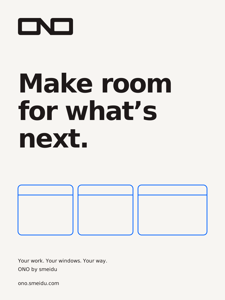
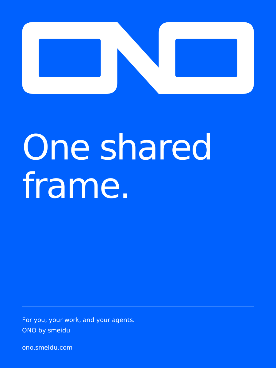
The same frame can hold a thought, a poster or a small everyday object. Use scale, contrast and clear space to make the identity recognizable without adding more branding.
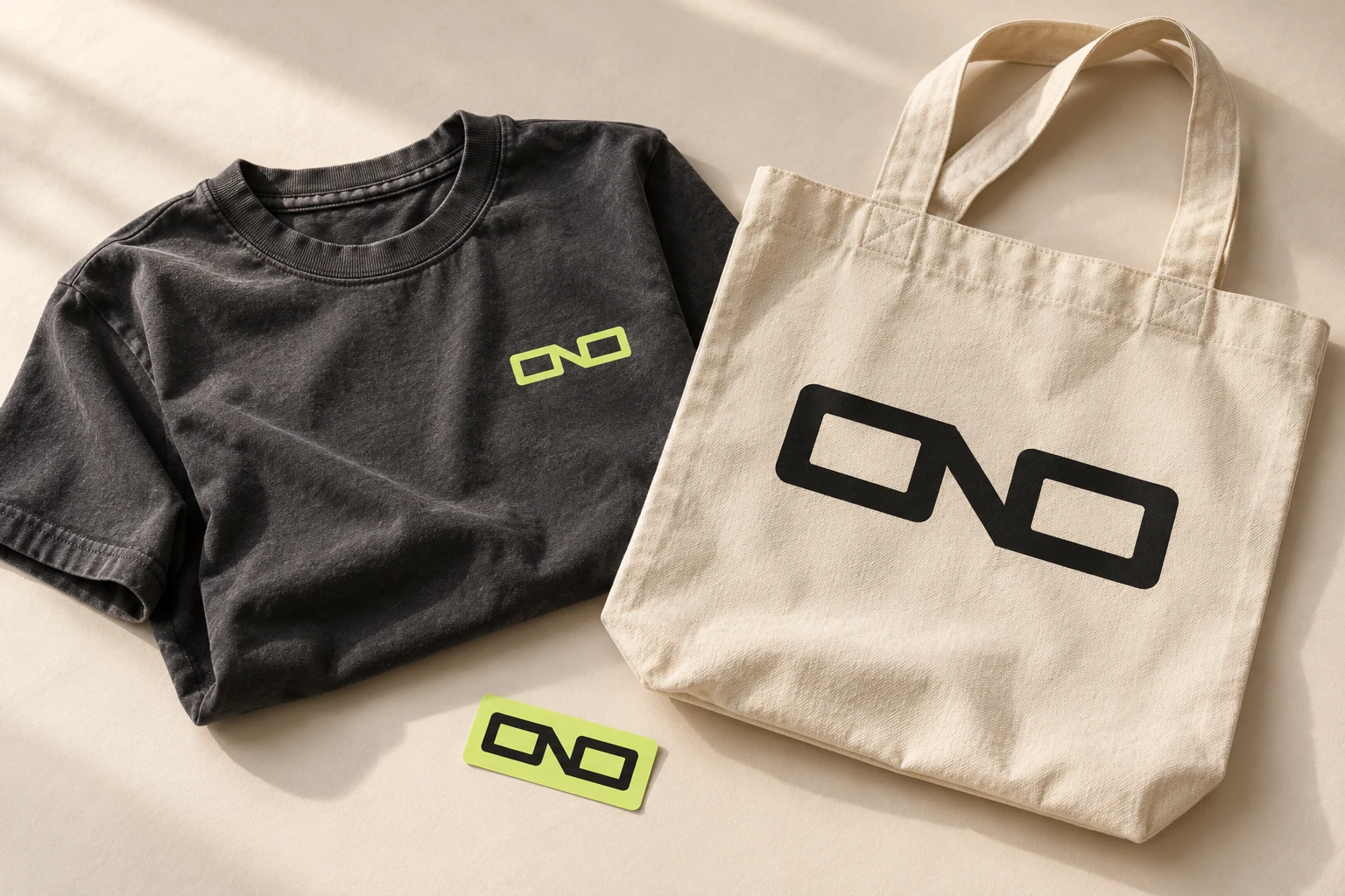
Keep a small chest signature quiet. Let the tote carry a larger mark. Use one-color artwork and generous clear space. On textured material, proof the open counters before committing to a print run.
The downloadable posters are editable RGB SVG studies with embedded Roboto. For manufacture, agree physical size, bleed, color conversion, font outlines and fabric proofs with the producer. The photograph is a concept; the exact master SVG is the production starting point.
11 / Resources
A compact kit for using ONO consistently: original vector marks, app icon, local fonts and licenses, editable posters, and all six app theme token sets.
Download design kitEdition 01 · ZIPJSON ↓Scoped theme variablesCSS ↓Shared Frame masterSVG ↓Kit contents & usage notesTXT ↗Fonts retain their included original licenses. This kit does not change the project’s source or brand licensing. Tokens are a versioned snapshot of app 0.1.21-test.1; new app releases may evolve them.
12 / References & stewardship
The references informed this system’s organization and level of detail. Their logos, typefaces and application artwork are not part of ONO’s kit.
A useful benchmark for giving identity, language, type and real applications equal attention. ONO keeps its own mark and artwork.
A reference for clear relationships between grid, typography and composition across digital and physical formats.
A benchmark for connecting semantic tokens, accessibility, interaction and component guidance.
A useful example of explaining materials and components through focused, inspectable specimens.
Maintained with the ONO source. Update exported tokens from the actual app, review component states across themes, then check narrow layouts, keyboard access and accessibility preferences before publishing. Source and maintenance notes ↗